Iterating towards a personalised home feed

Industry
eCommerceYear
2018My involvement
ASOS is one of the leading fashion e-commerce websites for young adults in the world. Selling hundreds of brands, shipping to over a hundred countries worldwide. It has millions of visitors to its website and apps every day.
The challenge
ASOS is one of the most well known fashion brands in the UK, and even throughout Europe and the US. Reaching this scale means they’re super successful, and sell millions of pounds worth of clothes every day. However, having a system that supports so many customers can’t be changed suddenly unless we have absolute confidence it will be successful.
The approach
The ASOS homepage gets heavy traffic, with over 10M visitors per day. However, after conducting several interviews and running usability tests I discovered that a lot of customers were frustrated with the homepage experience. I ran some surveys to quantify how widespread this frustration was and how customers would like us to tackle it (using a Kano Model study).
After discovering and quantifying this opportunity, I worked with a tight core team to gather stakeholder support, run tests, and explore a future vision we could iterate towards over the next 6-12 months.
The team
UX Architect (me), Senior UI Designer, Product Manager, Analyst.
Stakeholders, from the following departments: Content, Marketing, Studio, Android, iOS, Sitecore (CMS), Social, Data Science, Brand & Creative, Trade, Retail and Customer Care.
My impact
Research
- 20+ user interviews and usability tests
- 4,000+ responses from surveys run on asos.com
- 3 separate research studies run over 9 months
- Working with analysts and testing to combine user research with user behaviour data — and testing our hypothesises until reaching confidence
- Leading several presentations to stakeholders so they could understand research conducted and also understand the problems our customers were having
- Speaking to people from every affected department to understand how we can improve internal collaboration, and leverage existing effort to deliver value to customers
Design
- Leading several presentations to stakeholders to update them on progress made on design and testing
- UX Lead on the project, working with several PMs and UI Designers over 18 months
- Collaborating with a UI Designer — I produced initial designs, and contributed to future iterations and co-built a prototype in ProtoPie — on a vision for the future of the ASOS Home in app
Kick off
I conducted a series of over 20 user interviews, usability tests and ran surveys, with over 4,000 responses. From this, I gathered a multitude of insights about our customers.
We combined this with data from our analysts, to define a set of initial goals
1. Capitalise on heavy traffic
2 out of 3 visitors see the home screen at some point in their visit to the app or website.
On web 70% customers skip over home screen content, and open the nav or use the search bar.
Of the 15 to 30% that do interact with home screen content, most only interact with the hero image.
The hero image is updated every 2 weeks, leading to confusion around how often new items are added. We actually add 500+ items per day.
2. Improve positioning to customers
From surveys, I discovered that new and existing customers had very different priorities.
Amongst new customers, "categories" were the most desired content to see. Over 60% said they wanted to see this, compared to under 20% of existing customers.
For existing customers, "discount and sale" content was the most desired. Just under 60% telling us they wanted to see this, compared to under 8% of new customers.
From this, it seemed that new customers wanted to know more about what exactly ASOS's offering was. Existing customers, that already know our offering, are more motivated by discounts.
This suggested that there would be an opportunity in personalising the homepage, at least based on whether a customer was new or not.
3. Improve product discovery
Customers told us they find it difficult to find the products they like.
"It's like trying to find a needle in a haystack"
They love ASOS, but there's too many products to sift through. Some describe the experience as a "chore".
How can we remove this effort from users and do more?

Further research
I wanted to dive deeper into the initial findings from my user research, and data from the analyst. So I ran another round of surveys, getting just under 3,500 responses.
The majority — just under 40% — of customers want homepage content to refresh more often.
With almost 60% saying they would use the homepage more if it was personalised. With them being happy for content to be personalised based on preferences they've set and previous shopping behaviour.
Workshop
In order to progress with the project, the UI Designer, PM and I gathered all the stakeholders to participate in a Design Sprint, as part of the discovery phase.
We began by unpacking the outcomes we had as a business, from representatives of the following departments: Content, Marketing, Data Science, Brand & Creative, Trade, Retail and Customer Care.

The outcomes we wanted to deliver were written onto post-its. We used these to help create concepts that could deliver these outcomes for everyone.

These solutions were critiqued by everyone, and moulded into a series of modules. We could strategically deliver these in collaboration with one or more of the stakeholders or affected departments.

Out of all the ideas for personalised modules, the ones chosen to be tested over the next 3–6 months were:
- Capture customer style preferences
- Premier Delivery proposition messaging
- Delivery messaging
- Brand recommendations
- Product recommendations
- New In recommendations
- Greetings (e.g. "Hi Jesse")
Objectives
Following the workshop, we set a set of objectives all stakeholders agreed to for the next stage of work.
Improve speed and accuracy of product discovery:
- by capture explicit information from customers of their preferences, and use this to power recommendations
- to increase product views after homepage visits by 1% on iOS
- to increase re-visit frequency by 1.5%
Our mission statement:
We want customers to come back more, engage with more content and become brand promoters
This solution would need to be scalable, and work in multiple countries and languages.
The work
Armed with clear objectives, the next step would be to begin testing the personalised modules. I conducted further user interviews and usability tests of a simple prototype. I defined the content and flows, which were then designed by the UI Designer.
The prototype consisted of:
- a homepage with no personalisation
- log in flow
- a homepage with basic personalisation (greeting with participants name, order delivery info, etc.)
- a “Personalise your home feed” flow
- a homepage with in-depth personalisation (male and female with “Just for you module”, etc.)
A few screens from the prototype:

Findings
Responses to the personalised modules were positive. However, our participants were unsure about the placement of some of the modules.
“I guess there’s quite a lot going on… I wouldn’t get down to the brands view, which I would actually find quite helpful”
Screenshots from the user interview recordings:

Which led us to create another hypothesis:
A less static, more dynamic and personalised homepage would improve engagement.
I decided to begin investigation and research into this hypothesis, whilst the PM oversaw A/B testing the set of personalised modules.
Live testing
I created wireframes — using Axure — for the module concepts, so we could quickly explore all the possible iterations, behaviours and layouts.

The PM, tech lead and I put together a testing plan for our set of modules on iOS — after discovering iOS were positioned to run tests immediately. To prove the value they would bring to the business. We started with 3 test:
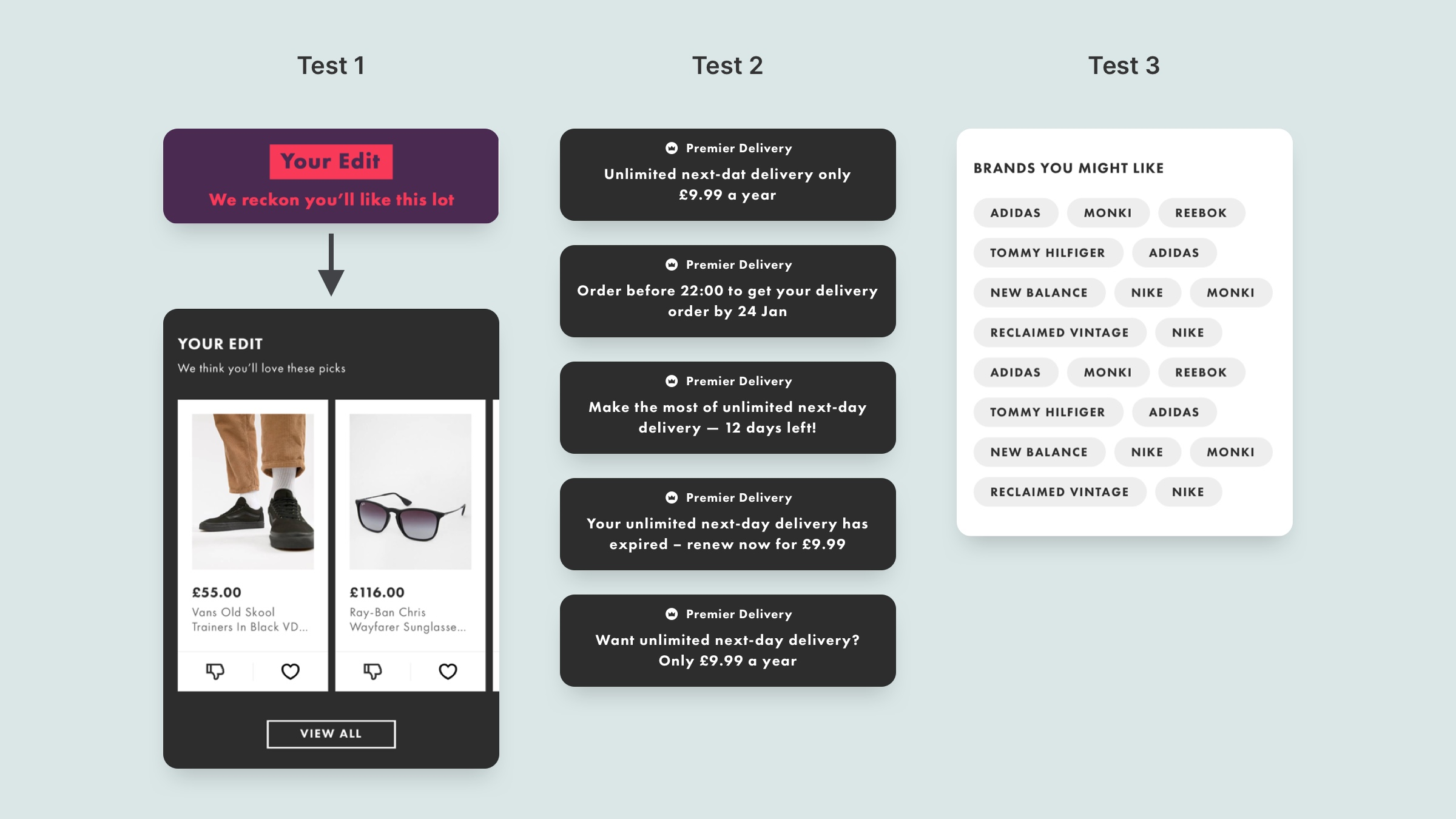
Test 1 — "Your Edit" (Product Recommendations) carousel
- increased visits to "Your Edit" recommendations by 24%
- Over 150% increase in "Adds to bag" from "Your Edit"
- Over 130% increase in visitors ordering at least 1 "Your Edit" product
- Reported to increase homepage revenue by around £116k
Test 2 — personalised premier delivery banner, MVT with different messaging
- cut-off time for next-day delivery, increasing integration by over 18%
- premier delivery expiring (in next 2 weeks), increasing by over 130%
- premier deliver has expired, increasing by over 190%
Test 3 — brands you might like module showing
- top selling brands, led to over 0.3% increase in paying visitors
- personalised brands, led to over 0.3% increase in paying and over 3% increase in brand page views
Tying it all together
To show how this experience could look to different customers, I put together a quick video for the team and stakeholders. This also showed how homepage personalisation, could work with personalisation projects on other parts of the experience.
Iteration
After a set of successful initial tests, we decided to use what we’d learn and go back into discovery to understand how we could use personalisation even more.
One of the earliest problems outlined, with having a homepage that would refresh more often, was having enough content. The homepage content mostly comes from Branding and Trade, whilst other departments put their content out via other channels, such as email and social.
By creating a system for all parts of the business (including Customer Care and Order Fulfilment) to create, tag and submit content — we could create a feed of content. This feed would be unique to each customer, with:
- UI and architecture optimised for easy personalisation
- newest content always on top
- Machine Learning used to determine what content is shown when
- content would present over top of feed, helping users keep their place
- direct links to recommended products and looks
- fun mechanisms to draw users to new content
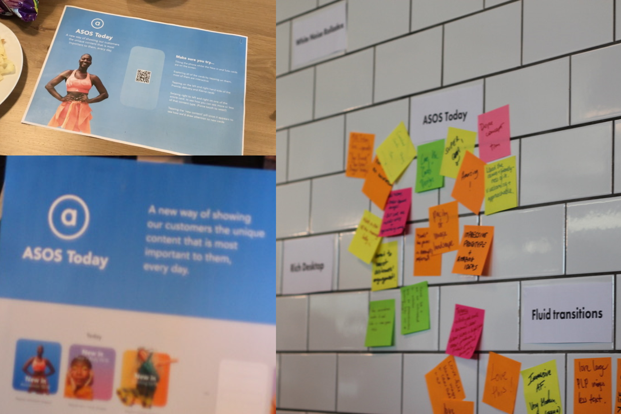
The UX/UI team would run an annual “The Great UI Exploration” showcase. Using the above, another UI Designer and I collaborated, and looked at what a future ASOS homepage home feed could look like:

This concept home feed was to be built using a streamlined component set, reducing the number from 8 to 2. This would make:
- future experiments and personalisation easier
- the homefeed more accessible (by improving contrast, using live text, etc.)
- updating or refreshing these components in the future easier
👎 The original 8 components:

👍 The proposed 2 components:

Which both had a set of customisable sub-components to allow for flexibility — from glossy visual-led cards, to simple messaging for anything from sales promos, through to personalised greetings or customer support (e.g. delivery times delayed by boats getting stuck in the Suez Canal):


From this next iteration, I hope to see the following outcomes:
- Content & Retail would better target customers, and have a feedback loop to customers, to help with improving out content.
- Tech & Engineering would have a simpler, but smarter system, which would replace complex and manual content systems.
- Digital Product would have a simpler system to roll out even more complicated tests, so we can iterate and test design changes faster.
- Customer Care can proactively reach out to customers, to help them aid customers and reduce contacts.